The thing about covers
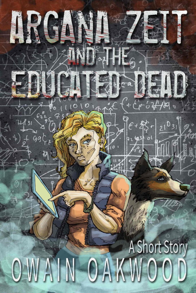
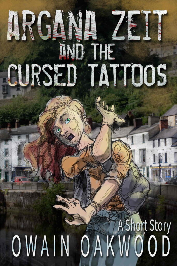
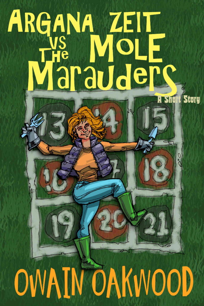
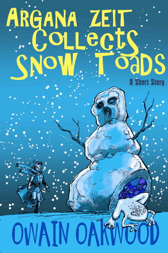
As you probably guessed by now, I do my own covers. I do my own tiling in my house, too. I could get someone in, and they’d do a better job in half the time, but I’m really driven by wanting to know how something is done. And now I know a lot about how to do tiling, and even more about how not to do it, and 100% enough to appreciate someone else doing it.
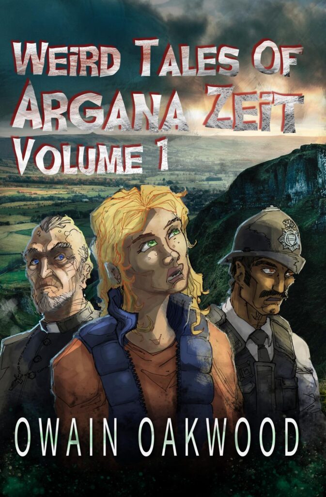
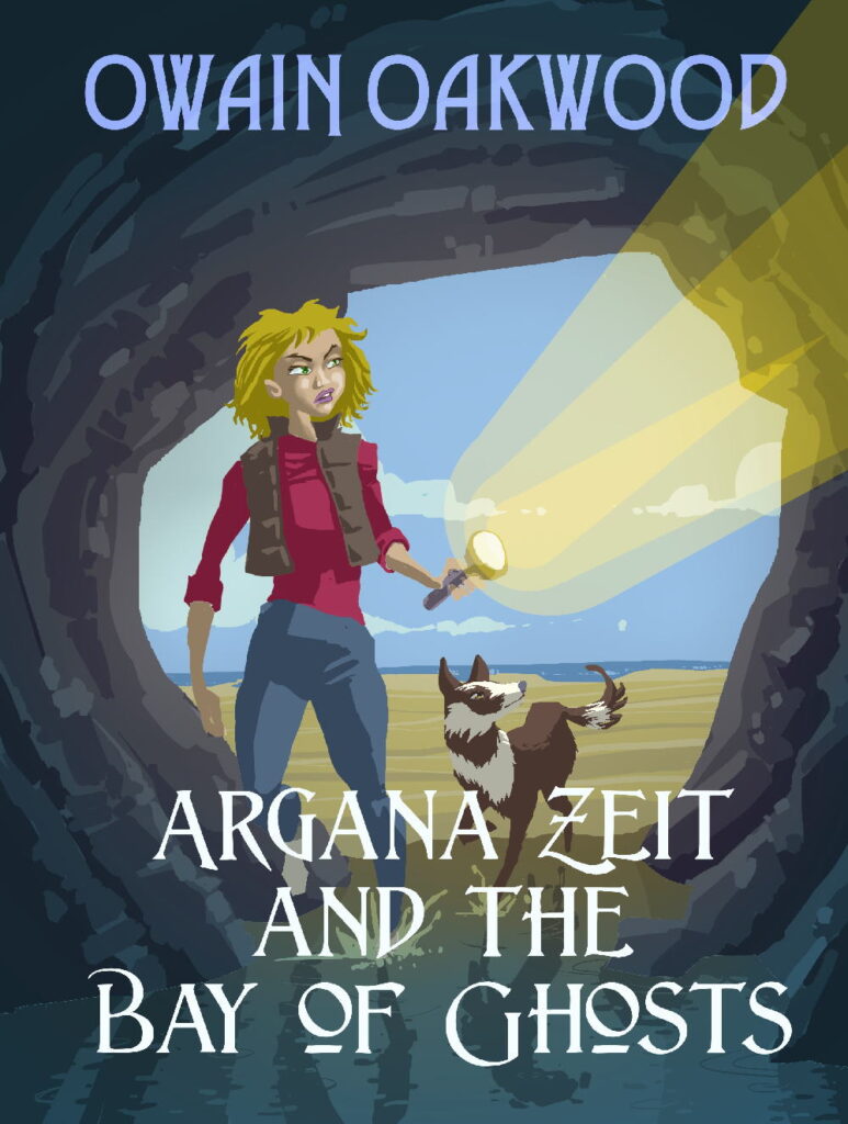
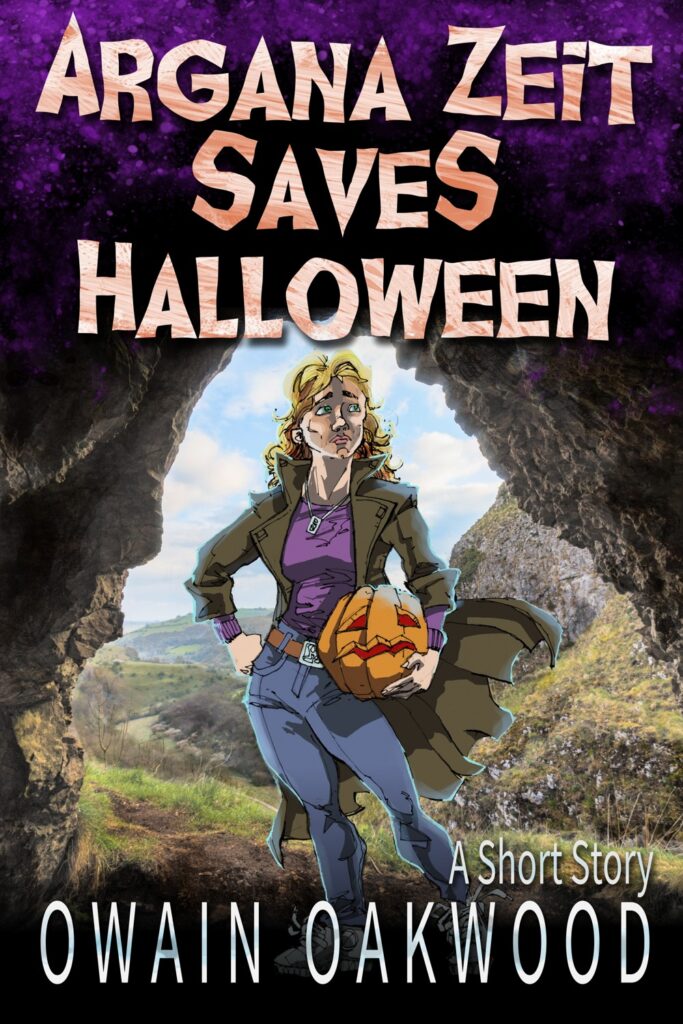
I’ve changed the cover to Paranormal in the Peaks 3 times, which is way more than I’ve ever had to re-do the tiling. When it was first published, it looked like this. It even had a different name! I’d got a subscription to depositphotos and wanted actual pictures of the peak district. In my mind when I visualise my characters, they’re as real as you or I, but I couldn’t find any photos that looked like any of therm. And although they look photorealistic in my head, I know the stories have a pulpy, comicy vibe. So, I drew the three most prominent human characters and chucked them on the cover.
Dust hands, job done.
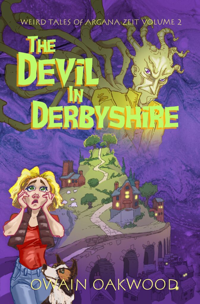
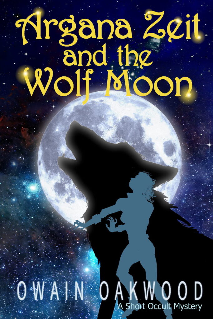
By the time I’d got to releasing The Devil in Derbyshire, I’d had plenty of feedback that the cover was off-brand. Not off-brand for me, but for the genre. People didn’t know what it was, and that was maybe putting off potential readers. Wanting to revamp it, I did what I hadn’t done the previous time. I looked at a bunch of genre covers. Argana’s a young protagonist with a bunch of allies and there’s spooky goings on … it’s urban fantasy, right? They’ve got dark, single figure covers with sparks of magic and stuff. Yeah, I can do that.
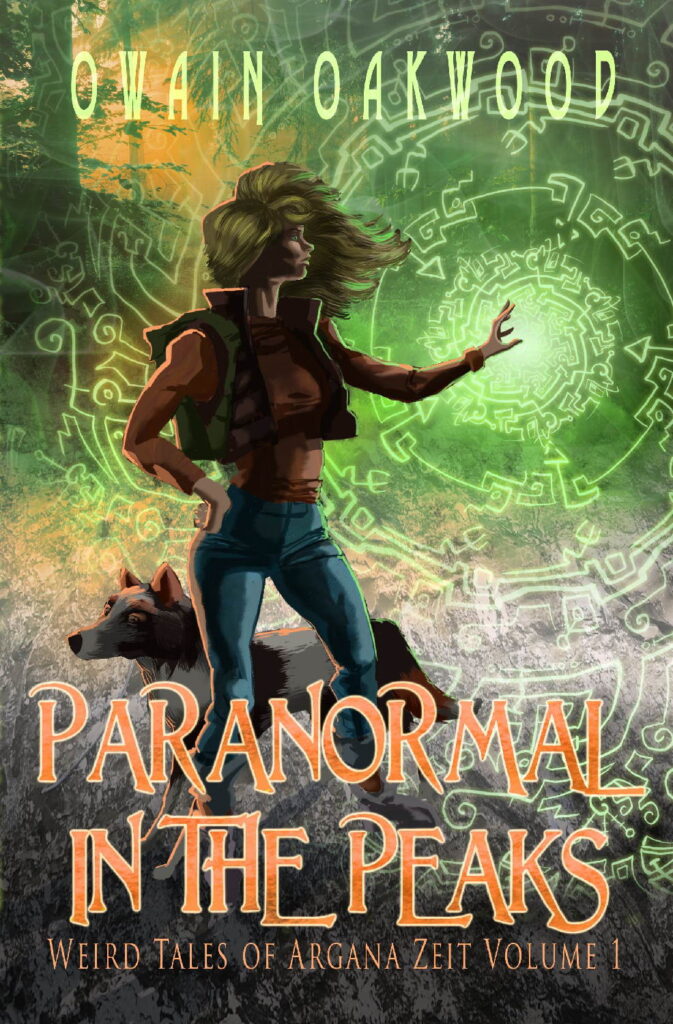
That cover did better. It looked something closer to professional, and it got easier to persuade new readers to take a punt on it. But something was dawning on me – AZ lacks many of the major tropes of successful urban fantasy. None of the main characters are vampires, were-wolves, zombies, plant liches or any other urban fantasy regulars. Nobody dies or shags on-page.
On the other hand, everyone lives in a quaint village where they all more or less get on. Plus, she has a dog and solves whatchamacallits. Ah. This is Cosy Paranormal Mystery, isn’t it?
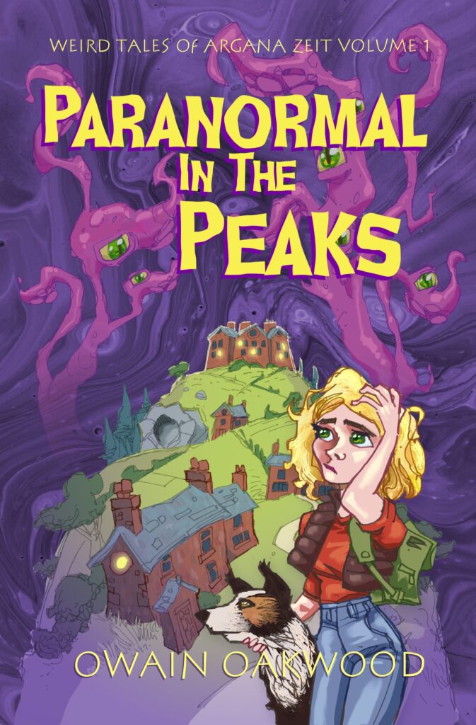
And Cosy Paranormal Mystery covers have an altogether different look. Dark purple or blue backgrounds, exaggerated illustrations without anything that could be described as perspective. Not a photo to be seen. Cheerful, chunky fonts.
Here we go then, round three. But maybe, like the bathroom tiling, I’ll pay someone to do it next time. You learn from your mistakes? Yes, well, you can learn too much 😉
